saishani global enterprise ltd.
Project Summary
Saishani Global Enterprise Limited is a sales and distribution company that deals in household appliances, cosmetics, fashion items and many more. The company had an unofficial brand identity and wanted a complete refresh of it.
This was an exciting project for me as I had never properly experimented with brand identity and design before. I had always looked forward to an opportunity to explore on it, so when I got the call, I was pretty much geeked to take on the project.
The information below were all I got to kickstart the project:
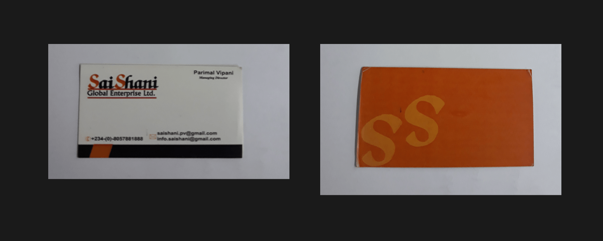
- Business card (front & back pictured above) with current unofficial logo.
- The brand name "Saishani" was coined from two Indian words - Sai (which is the name of an Indian god) and Shani (which means planet Saturn).
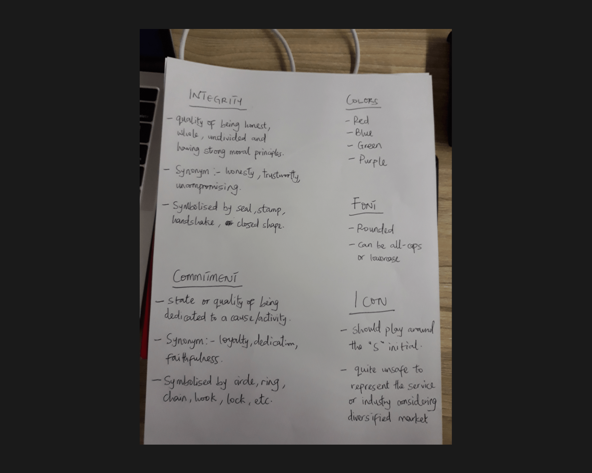
- The company's core values are "Integrity" and "Commitment".
- The company's market is large, diversified and growing.
- No color preference.
- The logo should preferrably play around the letter "S".
The process
I started out by trying to understand the brand and how best to represent the elements in the identity. I explored the core values, the industry the company belonged to, as well as the kind of products and services that they offer.
I did some research as regards fonts, colors and how they affect a brand's identity. I went ahead to define and highlight the elements and constraints that I would work with as seen below:
A number of blockers..
The client wanted to treat the name "Saishani" as two (but not separate) words, as seen in his current (card) design. He wanted some sort of camel casing as in "SaiShani" or an hyphenated version like "Sai-Shani".
Also, being my first time experimenting with logo design, I couldn't craft icons (logomarks) on my own. I also wasn't familiar with Adobe Illustrator as at the moment and even though I had a couple of ideas and sketches already, I definitely needed help bringing them to life.
I got a designer friend to help me with this and in a short while, some of my sketches were actualised, with a number of modifications. I then proceeded to build upon the logomarks provided by focusing on the logotype and color combinations.
Logo Option 1.
The first option tried to experiment with the hook symbol (representing commitment) and also some sort of handshake (representing integrity) for the logomark. I opted for a thick, uppercased brand name in Ubuntu font, and a thin, uppercased strapline with the Lato font.
Logo Option 2.
The second option sort of inherits from the first. The logomark is an "S" letter that cuts into a slanted rectangle. This time, the brand name is thick and lowercased in "Montserrat" font with a thin, uppercased strapline in Lato font (as in option 1).
This option was an instant favorite for the client at first.
Logo Option 3 (Preferred).
This was quite different from the other options. The logomark creatively plays on the letters "S" from Sai and Shani. It felt simple, and at the same time, it somehow embodied the company's values symbolically.
This option wasn't an instant favorite of the client but it grew on him after a while. A number of his staffs liked and opted for it also, so that helped with his decision-making.
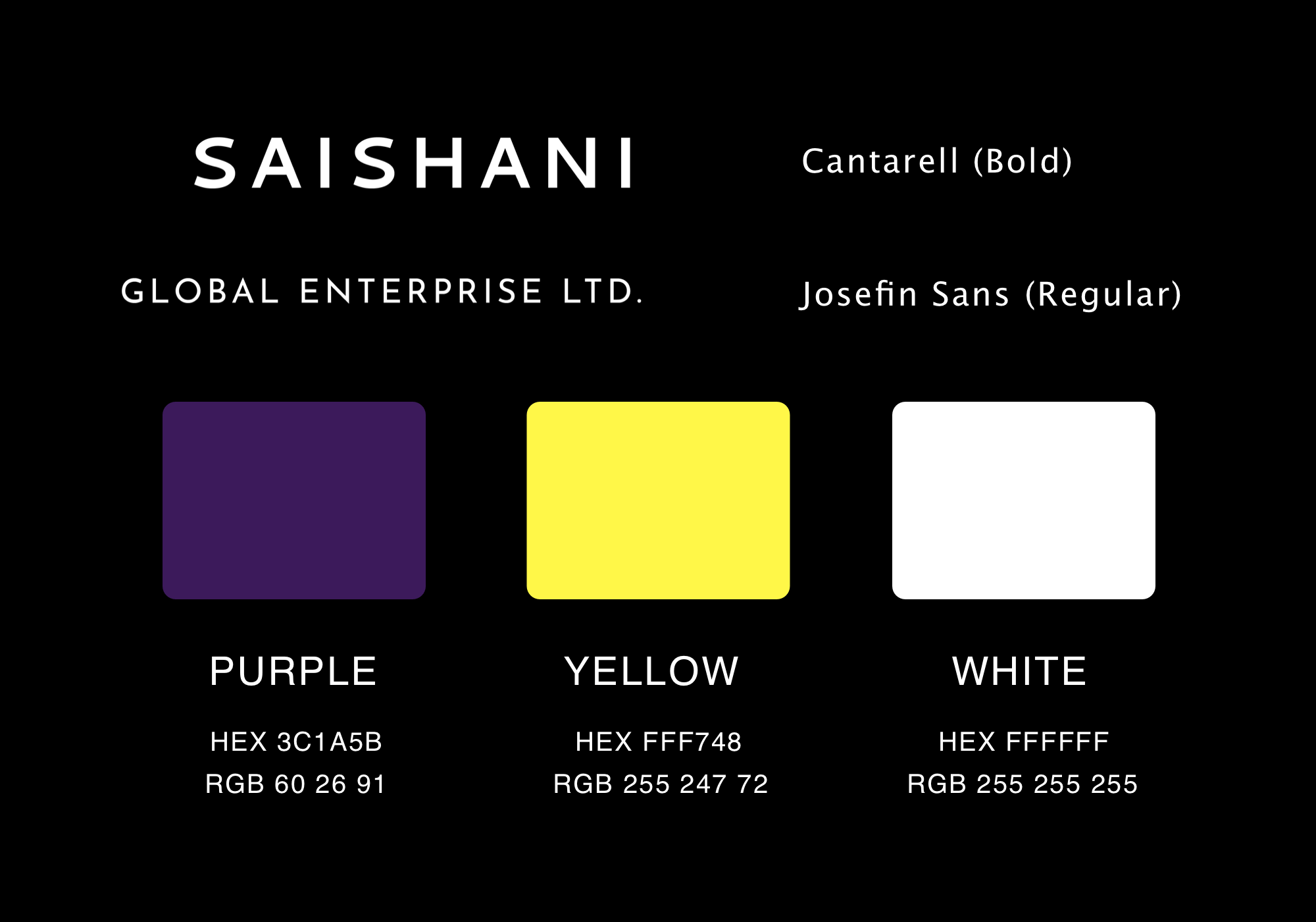
Color and Font
I discovered the color combination from a design article that I was reading as at the time regarding logo color options for inspiration. The font, however, was something I stumbled upon while working on another project. I decided to experiment with it and I totally loved the outcome.
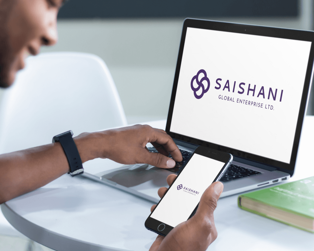
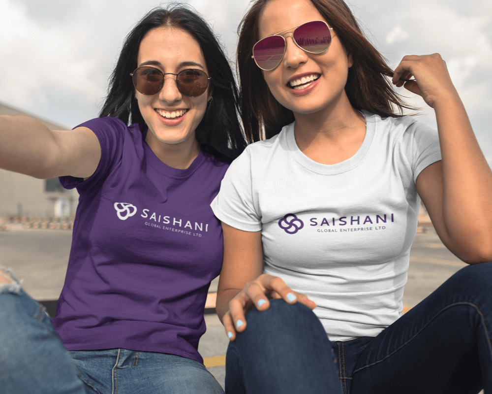
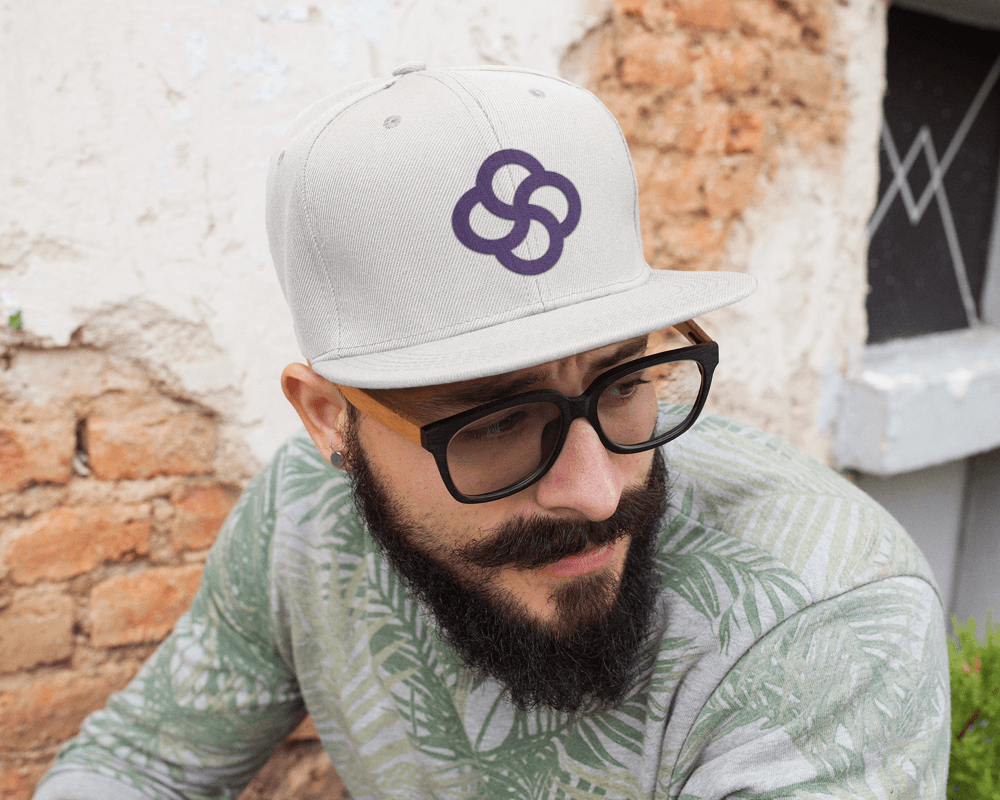
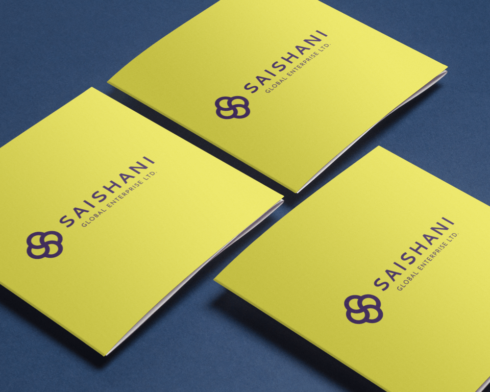
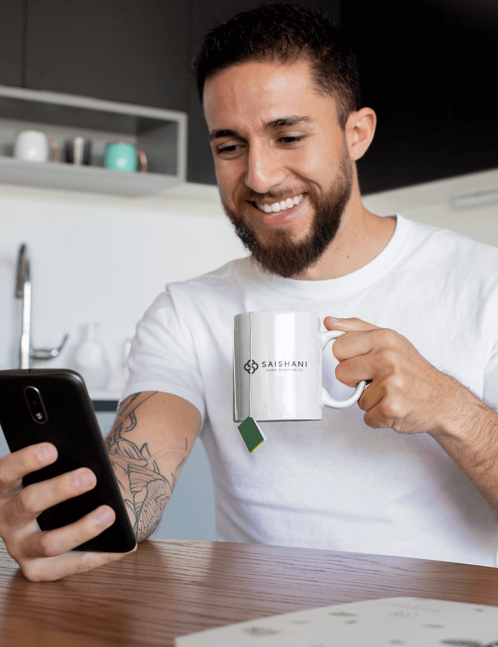
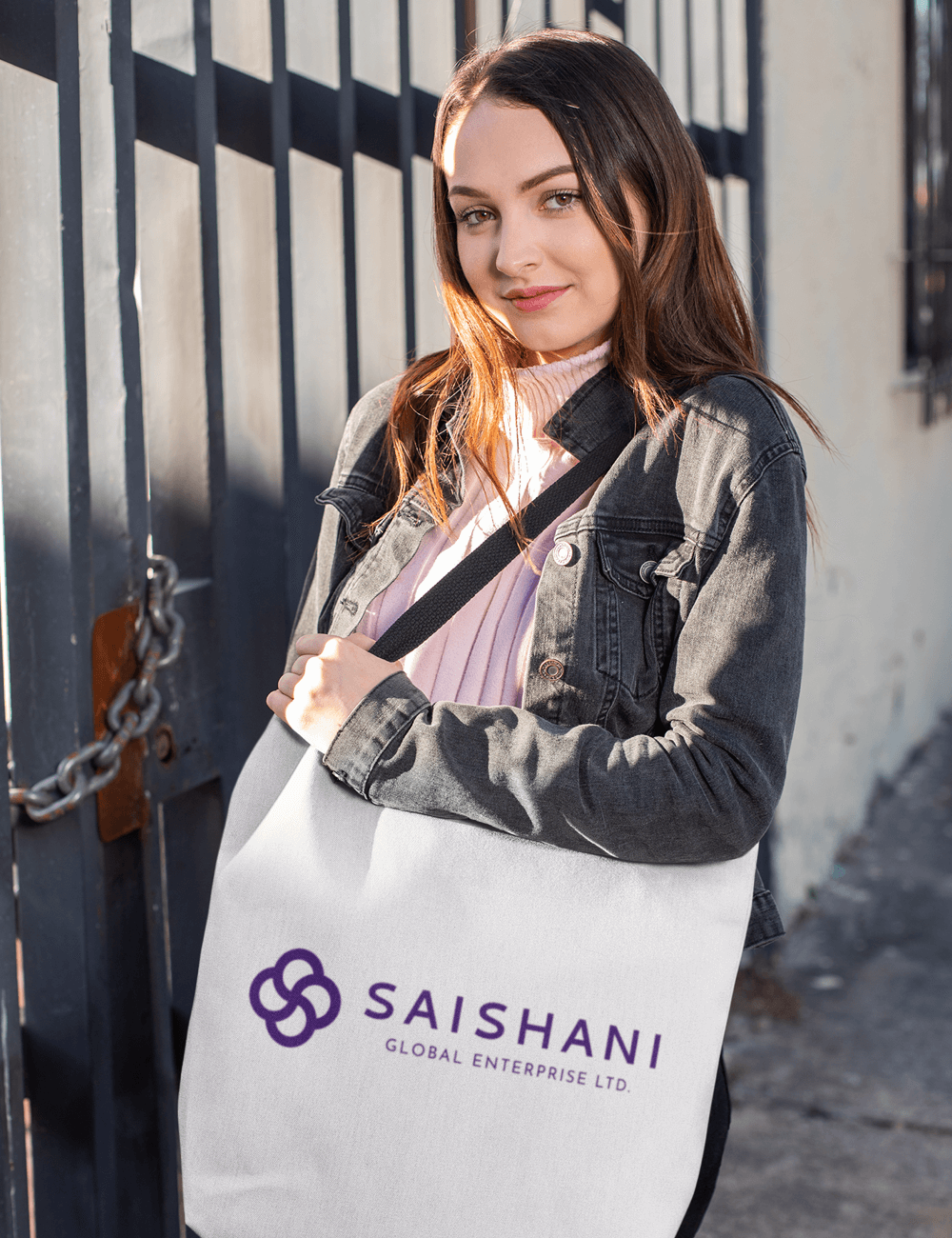
Logo Visualisation
With the help of some random online tool, I was able to visualise the logo on some stationeries, items and wearables; some of which are shown below:
Conclusion
Aligning the client's personal and business needs with branding principles was a daunting task. Earning the trust and confidence in my professionalism did not come easy as I realised that often times, clients want to hire professionals for creative jobs while also playing the creative director role.
With a lot of research and consultations, however, I discovered a number of workarounds for this and adequate requirement gathering tops this list; along with constant and thorough communication of ideas and processes.
The entire process helped me understand how important decisions such as color and font choices affect branding. It helped me understand how best to present brand identity concerns and options to a client in order to help them understand how it affects their business.